How Promotional Bags Solved Headaches for Panadol #CleverPromoGifts
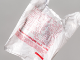
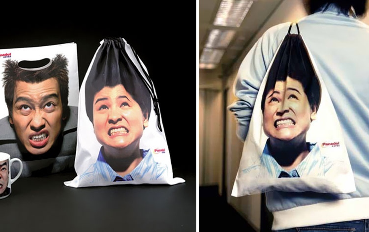
Pain relief heavyweights Panadol used these cleverly designed shopping and drawstring bags to convey their brand's marketing message. The pained expressions of the people on these bags are striking. But where the bags are really clever is in how the person holding the bag adds more meaning to the image. On the tote bag to the right, the way the user is holding the bag makes it look like their clenched fist is punching the man in the head! The one below makes use of the drawstring function to make it look as though the top of the person's head is being painfully crushed.
 The man on the left looks like he's being punched, whilst the woman seems to be having her hair pulled
These bags clearly emphasise the brain battering pain of a headache, and the discrete logos in the corners subtly imply that it is precisely this pain that Panadol will cure. The company decided to focus their message on the eye-catching image and print their logo small and unobtrusively. This branding strategy is known to make recipients of gifts use them more in public. If you're worried about the logo not being noticed - because of the striking image, people might just be curious enough to look for the maker of such clever goodies.
If you think a clever branding design like this could benefit your business, have a look on our website for inspiration from our wide range of shopping bags.
Talk to Us
»
01204 577 995
info@UKCorporateGifts.co.uk


