Our Top 5 Winners of Cannes Lions 2014
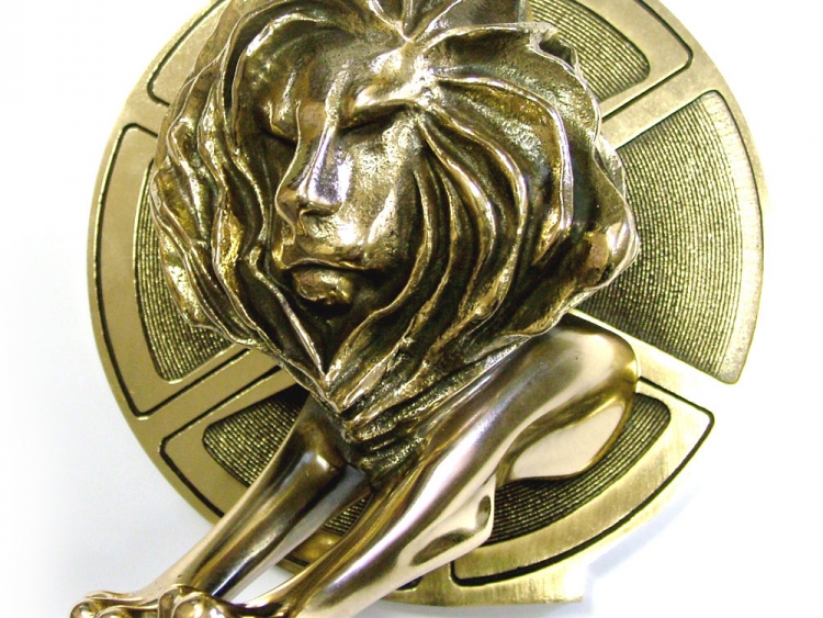
Cannes Lions is the glamorous event of the year in the Creative Industry. It is full of talks and workshops by industry experts, and it's an opportunity to network and exchange ideas, and to find out what the top advertising campaigns were in the past year. We were so inspired by the awards in the 2014 event, that we decided to compile our top 5 of the Cannes Lions. Presented below, with top prize at the end. Enjoy!
5. Cavities Attack at Night
The campaign by Red Fuse Communications for Colgate-Palmolive is a great example of advertising that creates awareness not only about a product - tooth paste - but also about health issues. Targeted at children and schools, it educates about the importance of brushing your teeth. We love how the agency cleverly reused their existing packaging by overprinting the inside of the toothpaste cartons with diagrams. By doing that, they reached out to local communities and provided schools with additional teaching materials. Packaging is a powerful marketing tool and has the power to change how what's inside is viewed completely. Why not ask us about packaging option for your next campaign?
4. Australia Day
Who says rebranding exercises are detrimental to brand image? Not if they're done with customer experience in mind. McDonald's in Australia and DDB Sydney, the advertising agency behind Australia Day, decided to take advantage of the friendly nickname Australians have for the restaurant - Macca's - and rebranded all their shops and advertising to specifically that name for one month. The result? A resounding success! Sales shot up by an impressive 6.7% from the year before and Macca's was on everyone's lips.
3. Bills Only Collection Box
 The new money box design increased donations by a massive 2,000%
The promotional merchandise entry this year made very exciting news around the office and we just love this great idea! JWT Mexico, the agency employed by Red Cross, tweaked the traditional design of the money box and replaced the coin slot with a round hole, so that donors could only donate bills. Red Cross' donations increased by 2,000% that year. If you need a money box for your campaign, view our range here, or give us a call to discuss your needs. Bespoke options are available.
2. Trojan Mailing
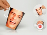
Cheeky, brazen, audacious - these are some of the words to describe the campaign by Jung von Matt Stuttgart for DHL. In this yet another example of clever use of packaging, DHL competitors we paid to deliver inconspicuous-looking boxes to obscure and difficult-to-get-to locations in city centres. What they only discovered later was that, in warm conditions, the black boxes revealed a message applauding DHL! Pedestrians were quick to pick up on the absurdity and hilariousness of the situation and pictures and YouTube videos of the deliveries went viral. Genius! If this inspires you to do a prank of your own - look at our colour change mug, that reveals a different design when filled with hot beverage, or ask us about colour change umbrellas!
1. Sorry I Spent it All on Myself
The campaign by Adam & Eve DDB for Harvey Nichols won the Grand Prix in four categories and picked up five Gold Lions, so it's no surprise that it's also our favourite. The special Christmas 2013 gift collection for the selfish was a budget range aimed at those who wanted to spend less on others and more on themselves. The campaign was launched as print ads and films and brought about a change of tune in the classic Christmas campaigns, making the store truly stand out. BTW, a range like this is easy to compile - ask us for details if you fancy a cheap as chips campaign like that!
Do you agree with this shortlist or do you think it should look different? What were your favourites?
Talk to Us
»
01204 577 995
info@UKCorporateGifts.co.uk


